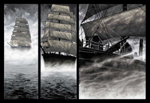
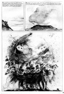
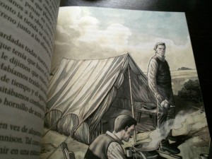
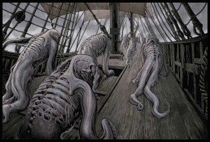
Tag Archives: weird art

John Coulthart: Axioms & Other Dark Beasts

We’re delighted to be joined today by an outstanding and award-winning illustrator of what we loosely term ‘the weird’, John Coulthart. We glide through artistic techniques and influences, discussing John’s cracking website, his own writing, Lovecraft and Ligotti along the way. And we have an exclusive view of the original cover design for his Axiom project. It doesn’t get much better (unless you were hoping for a photograph of Django running into a tree).

We would say something else nice and introductory about John, but really the interview and the art tell you what you need to know. So let’s just do this thing…

coulthartprofile

greydog: Welcome to greydogtales. For once we’re not sure where to start. Not only do you produce striking illustrations, but you also write, and you provide a website packed with fascinating articles, weird trivia and the work of other illustrators. Do you see yourself as an artist with sidelines, or a multi-media person?

coulthart: Art has always been the dominant thing, and it’s how I make a living, but I realised I enjoyed writing when I was about 9 or 10, and that I had some facility for it. The first thing I had published in any form was a poem in the local newspaper when I was 10. In secondary school I won the art prize but a year or so later I was thinking seriously about getting fiction published somewhere. I’d been writing and illustrating a lot of derivative fantasy stuff, and working on a novel that never got very far because I kept writing and rewriting the first few chapters. Shortly after that I was creating album artwork for Hawkwind but also writing another novel, a wildly uncommercial thing that was almost wholly dream sequences and “experimental” prose. I only stopped the writing when I started adapting the Lovecraft stories since that was a very labour-intensive process. I’d also realised by that point that I needed to think more seriously about why I wanted to write fiction when things were going well art-wise.
Print
steampunk, john coulthart

greydog: For some people, achieving a blog like feuilleton would be enough in its own right. It’s like greydogtales, but produced by someone who knows what they’re doing (greydog is an unrepentant grasshopper, and about as complex). Is the multi-layered nature of feuilleton a reflection of your own personality, or are we reading too much into it?

coulthart: Ha, I didn’t know what I was doing at all when I started. The thing appeared on a whim after someone asked me to helped them put a website together. I installed a database and WordPress so they could have a blog/news feature then realised a) that it was relatively easy to set up, and b) I could do the same for myself. It didn’t feel at all serious until 2007 when I wrote a lengthy piece one weekend about the album cover art of Barney Bubbles who I felt was under-represented on the web. That one post received a huge amount of attention, and led (indirectly) to a book of Barney’s work being published, and my name appearing in the New York Times. The discipline of making a daily post has helped hone my writing, at least where non-fiction is concerned. It’s also led to my being asked to write a few paid pieces for design magazines, something I never expected at all.

It’s very much a reflection of my personality since I don’t write about anything I’m not interested in. I like the flexibility of the form: you can write short or at great length or even only post links as I do each weekend; you can include visuals or videos or music mixes; and you control the platform more than you do in social media. I’ve found individual posts to be very useful for having a fixed statement or essay available in a public space. I’ve spent years telling people about David Rudkin’s TV play, Penda’s Fen, for example, but there’s no need to repeat yourself at length when you can send someone a link to something you’ve written.
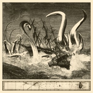
tentaclelatitudes
tentacle latitudes, john coulthart

greydog: Penda’s Fen was our introduction to Manichean dualism (we don’t get to say that often) many years ago, and left a lasting impression. If you watch it as a teenager, it raises so much about your identity, your sexuality and your belief systems – and somehow indelibly writes Edward Elgar into the mix. Everyone should see it. And you’ve written at length about David Rudkin‘s work in the recent book Folk Horror Revival: Field Studies (link on sidebar).

Back to business. We’re asking all our feature artists something about the professional process, for those who don’t work in this field. You’ve undertaken a lot of commissions from publishers. How much creative freedom do you tend to get when executing a book cover?

coulthart: It depends very much on the publisher and art director commissioning the work, but most mid-range publishers, and all the big ones have specific ideas of the direction they want to see you following. Some novels make certain cover designs seem inevitable whereas others might suggest any number of different approaches; if the book is in the latter category then it helps to have someone dictating the direction before you begin. The worst kind of job for a designer or illustrator is one where the client doesn’t know what they want but insists on guiding the project, or—worse—changes their mind once you’ve started work.
Print
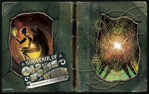
necronomicon, john coulthart

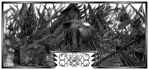
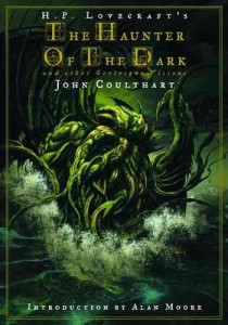
greydog: Often the first thing that we notice when we see a Coulthart piece is the amazing intricacy of your style. With something like the interior illustrations for The Haunter of the Dark, for example, how long would a single page/plate take to be completed?

coulthart: All those Lovecraft pages took around two weeks to draw which is why I stopped using such fine pens when I started work on the Lord Horror comics. At the time I only had one Rotring drawing pen which had a 0.2 mm nib. Rotring pens are expensive precision things, and I didn’t have the money to buy a set so I got used to shading with extremely fine lines. By the time I started on the Lord Horror comics I had a few more pens so I switched to 0.5 which is still a fine line but it halved the production time.
cthulhu5
cthulhu, john coulthart

greydog: A number of your pieces remind us of the detailed work of Victorian and Edwardian illustrators. Gustave Doré springs to mind immediately. Is this an area you mine for inspiration, or an accidental reflection of earlier approaches?

coulthart: Yes, the atmosphere of Doré’s work was something I was aiming at when I began The Haunter of the Dark. I wanted to get away from the poor science-fiction art I’d been creating for Hawkwind, and also try and present Lovecraft’s stories pictorially with the same seriousness they had on the page. I dislike the EC style of horror comics with some chuckling host popping up at the end to crack a joke. The initial impetus came from Berni Wrighton’s Frankenstein portfolio which borrows from Doré’s Ancient Mariner in two of the plates. (He was actually working more in the style of Franklin Booth but I didn’t know this at the time.) Wrightson has done a lot of EC-style art but the Frankenstein drawings were intended as illustrations not comic panels. I’ve often said that my Lovecraft strips are really illustrated stories presented in a sequential form rather than comic-strip adaptations. I’ve never really considered myself to be a comic artist, I’m an illustrator who happened to choose the comics medium for those stories because it gave you access to every part of the story. The page layout and drawing style is much closer to European comics even though the subject is predominantly American.
rlyeh2_1024
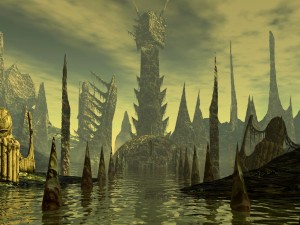
r’lyeh, john coulthart

greydog: When it comes to artwork, from which single project of yours did you gain the most personal satisfaction, regardless of reception or remuneration?

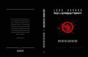
coulthart: That would be Lord Horror: Reverbstorm, the collected (“graphic novel”) edition of the Lord Horror comics I worked on with David Britton during the 1990s. Reverbstorm was a once-in-a-lifetime opportunity to create a comic series that was excessive and transgressive knowing all the time that it would still be published. My ink drawing in Reverbstorm is the best I’ve done anywhere, while the comic itself throws Modernist literature (mostly Joyce and Eliot) and Cubist/Expressionist art into a soup of material from Burne Hogarth’s Tarzan comics and the cosmic horrors of Lovecraft and Hodgson. There’s never been anything in comics that offered these kinds of juxtapositions over so many pages.
Print
lord horror: reverbstorm, john coulthart

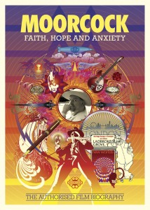
greydog: Let’s escape art for a moment. We grew up on the albums Hall of the Mountain Grill, Warrior on the Edge of Time and Michael Moorcock‘s New Worlds Fair, and you’ve done cover art for Hawkwind. Were you also interested in that musical ‘zone’, or was it just another job?

coulthart: Yes, I liked Hawkwind a great deal circa 1980, and I still like the albums they made in the 1970s. I also liked a lot of other music at the time that was more of its time – groups such as Cabaret Voltaire – but Hawkwind were attractive for the loose mythology that surrounded their albums and the group. A lot of the mythology was simply the product of Barney Bubbles’ sleeve designs so the combination of those two things – design and mythology – led me to start drawing a series of Hawkwind-related pictures. In the summer of 1980 I was lucky to meet someone who knew the band so that in turn led to my being asked to work for the group shortly after. This was a great opportunity at the time but it was also frustrating as I was trying to produce designs as well as illustrations but without having access to any of the facilities – or contact with the printers – that you needed to create graphic design. The disaffection – and dissatisfaction with my own work – pushed me to quit the album cover work and do something completely different which was the HP Lovecraft comics.
Print
moorcock, john coulthart

greydog: And we are, at heart, a blog about weird fiction, a term thankfully hard to define. Which written works in this field stand out most for you as a reader?

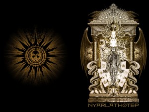
coulthart: There’s too many to choose so I’ll concentrate on man-of-the-moment Thomas Ligotti. I dug out my old copy of Songs of a Dead Dreamer before the new Penguin edition came out, and I’ve recently read Teatro Grottesco and Grimscribe, neither of which I’d read before. A lot of contemporary genre writing bores me because it reads the same: too many authors whose unobtrusive prose styles would render them indistinguishable from each other if you removed the names from their stories in a collection. You can’t say this about Ligotti: his prose and his obsessions are as immediately recognisable as a few seconds of animation by the Brothers Quay. Grimscribe is good but Teatro Grottesco is even better, and is essential reading. It’s disgraceful that books of his are currently out of print but then this was the case with Robert Aickman for many years, and it’s still the case with other exceptional writers.
nyarlathotep-modofly
nyarlathotep, john coulthart

greydog: The author Ted E Grau, who we interviewed here last week, is also a huge Ligotti fan. Tell us about your own fiction. You’ve written a number of short pieces, both fiction and critical reviews, and you have a long term project, Axiom, on which you’ve been working for some time. Do you have a specific ambition as regards your writing?

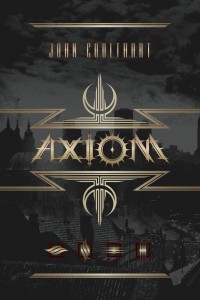
coulthart: At the moment the ambition is to get my two novels published. Since 2001 I’ve been labouring on the Axiom project which has become quite a substantial thing although little of it has been made public. When you have a career in one medium it can seem like folly to be trying to pursue a separate career in another but as I said earlier, I’ve been writing fiction for years. The difference this time is that the new work is the first I’ve produced that I was at all satisfied with. The Axiom project emerged after I’d finished work on Reverbstorm: I’d spent several years collaborating with other people and wanted to return to creating something substantial of my own. Reverbstorm has an invented city as its location, and it was while working on that I realised that taking this in a different direction would give me something that reflected my own interest in real or imaginary cities, in architecture and so on.

So the first novel, Axiom, establishes a setting for a proposed series of works in different media. The frame is such that this could support a narrative with few (or no) generic features, or something that was full-on cosmic horror. A city always is a useful device if you want to tell a variety of stories, and there are many fictional precedents. Axiom (the novel) is four connected narratives that describe a year in the life of the city, the tone being dark fantasy grading to horror. I have an agent who’s tried the book with all the main UK genre imprints, including a number of places I wouldn’t have considered if I’d been sending it out myself. We did get an offer from one UK publisher, and things had reached the contract stage when they promptly went into receivership. I’ve been surprised by some of the reactions towards the sexual content: this, more than anything else, seems to have been a problem for the book being accepted. It sounds ridiculous in 2015 to say you’re being rejected on account of this but that’s what we’ve been told. One of the reactions made me wonder whether they’d read any Ballard or Barker or Burroughs. This situation has been a surprise mainly because I don’t regard what I’ve been writing as being particularly transgressive, it’s just that one of the things I’ve been exploring (which was also touched on in Reverbstorm) is what I call the Eros of the Monstrous, in other words giving your abominations a sexuality. It’s evident that some people aren’t keen on this but it’s a subject that interests me, and I’ve been working on new art and writing that explores this further.

Another stumbling block seems to have been working in an area which (to me) is midway between the genre world and the literary world. I like these hybrid zones wherever they occur but the business of publishing isn’t always encouraging of things that don’t easily fit their boxes. We took a similar approach with Reverbstorm which I’ve called a psychopathology of heroic fantasy: the trappings of adventure comics were present throughout, especially references to Burne Hogarth’s Tarzan, but the narrative veers continually away from this into Modernist styles and techniques. This is the perfect way to limit your audience: you alienate the people who want the swashbuckling adventure stuff, and you get little interest from the art crowd who are put off by the vulgarity elsewhere.

The second novel in the Axiom project, Vitriol, is a 217,000-word doorstop featuring invented psychedelic drugs, sword fights, occult rituals, para-dimensional monstrosities, an alchemist war, and a great deal of gay sex. We had a very nice rejection for this one from a major UK publisher who said they loved the book but didn’t think it was commercial enough. I’m hoping this isn’t the consensus as I spent seven years writing Vitriol, creating the kind of book I’d want to read myself but which I couldn’t find on the shelves; on that level it’s the most satisfying thing I’ve done, and it’s also a better novel than the first one. Many people have assumed I’d opt for self-publishing these novels which is still an option – I design books, after all – but publishers have the advantage of marketing and distribution. In the meantime, I’ve been working on material for a new Axiom book that will combine short pieces of fiction with graphics, and also thinking about a new novel.
Cover 5
original axiom design, john coulthart

greydog: We can only wish you good fortune on the whole Axiom venture. As we grew up reading Burroughs and books like Samuel Delany‘s Dhalgren (pretty wild for teens from a small Yorkshire town) it seems retrogressive that  sexual content in this sort of fiction should be a block.

Now, we love discovering new illustrators of the weird. Can you suggest someone else working today who stands out to you, someone with whom we might not be familiar?

coulthart: I think you may already know Santiago Caruso’s exceptional art (http://www.santiagocaruso.com.ar/). His finely-detailed Lovecraftian pieces were one of the highlights of the NecronomiCon art show in Providence in August. Elsewhere I’ve been impressed by Caitlin Hackett’s surreal fairytale drawings (https://caitlinhackett.carbonmade.com/projects/3016488), Jason Grim’s disturbing self-portraits (http://www.jasongrimart.com/#!photography/c24t1), Alison Scarpulla’s mysterious photographs (https://www.flickr.com/photos/aliscarpulla/page2), and Cristina Francov’s strange paintings (http://www.cristinafrancov.com/en-galeria-obras-selectas.html).
gods1yigg
gods of yigg, john coulthart

greydog: Glad you mention Santiago Caruso. His work is particularly stunning, and we’re currently obsessing on the range of fine South American illustrators (see earlier Sebastian Cabrol post). We hope to have more of them on greydogtales in due course. So what other Coulthart project(s) can we look forward to seeing in 2016?

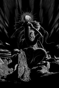
coulthart: On the shelves at the moment there’s The Gods of H P Lovecraft, a collection of new stories from JournalStone Publishing, edited by Aaron French. I illustrated six of the stories, each of which concerns a different Lovecraftian creature or entity. Also out in January (I guess, because I haven’t been given a release date) is a book design for a large US outlet that I’m not saying much about at the moment since I want it to be a surprise. But it’s going to be a lavish production so I’m looking forward to seeing it. And I’ve just received a commission for another project that will have to remain mysterious but this will be an alternate history by a well-regarded author scheduled for release in late 2016. Further off, I’ve agreed to illustrate William Hope Hodgson’s The House on the Borderland for Swan River Press. There’s no schedule established for that one but I’m planning on starting work in the New Year.
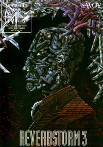
rev3cov
reverbstorm 3, john coulthart

greydog: Thank you so much, John Coulthart. We highly recommend John’s website, feuilleton, which is a miscellany of thoughts and wonders, and can be found through this link:

feuilleton

(Of course, we also highly recommend that you check out some of the previous posts mentioned on greydogtales as well, but our site is better described as a bucket of things we tripped over when trying to avoid the dogs. Interviews with Ted E Grau and Sebastian Cabrol can be found by checking on the left.)

Apart from The Gods of H P Lovecraft, you may also want to have a look at John’s Haunter of the Dark book while you’re browsing. The UK link is on the right-hand sidebar:

haunterHaunter of the Dark US

In but a few days we bring you one of our finds of this autumn – a  heavily illustrated feature on the terrific Danish folklore/folk-horror artist Jorgen Bech Pedersen. We’ll try to fit some more longdogs in before the end of December. And we might have a few days off, you never know…
Share this article with friends - or enemies...

Raphael Ordonez: Fractals & Fantasies

On the principle that greydogtales is another country, we’re being different again. Today’s feature is an unusual illustrated interview with mathematician, artist and writer Raphael Ordonez. We initially asked the erudite Raphael to join us as part of our weird art theme, but there’s much more to it than that – we slide in and out of fractals, fantastic illustrators, biology and his own fantasy fiction along the way.

As greydogtales is also a grasshopper in that other country, we first came across Raphael accidentally through his blog, Alone with Alone (link at end of interview), and then discovered his interest in William Hope Hodgson. We had to delve further. So here are some thoughts from the chap himself, and some terrific pieces of art.

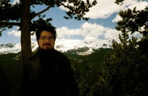
Me in CO

greydog: Welcome, Raphael. As you know, we’re majoring on weird art and illustration here at the moment. You’ve done paintings from real life and some quite fantastical pieces.

ro: You could say that fantasy illustration is how I got into art. In school I often got in trouble in math class for drawing pictures of monsters and goddesses and maps of imaginary countries instead of listening to the teacher. When I went to college as an art student, it was with the intention of becoming a fantasy illustrator. I can only do that kind of art when the mood hits me, though. That’s probably why I abandoned that idea of a career. Or maybe I’m just capricious.

When I paint from nature, I’m generally going for a purely visual, abstract beauty. The urge to paint something round and red strikes, for instance, and I go find a mountain laurel bean. This kind of motivation has grown up slowly in me over the years. Paul Klee, whose art was very abstract, describes a painter as a tree, drawing material up out of the earth and turning it into a crown of leaves, transforming it in the process. My art is very different from his, but I think he really captured what it’s all about.

In Forms and Substances in the Arts, Etienne Gilson describes the perennial opposition between “drawing” and “painting,” that is, between art as illustration and art as visual beauty. I feel this tension in myself, and continually vacillate between one and the other.

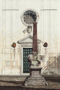
santa maria sopra minerva, ordonez

greydog: The first thing we noticed was the strength and clarity of light in your paintings. Is this about personal style, or is it also something to do with the quality of the light where you live?

ro: I like sharp chiaroscuro in most everything in life, including art. Perhaps that’s why I love the Santa Fe area so much. My paintings tend to reflect the high deserts and plains of the American Southwest rather than where I live, that is, the South Texas brush country. Though I’ve been here most of my life, I find the general quality of light uncongenial. Lately I’ve been doing paintings of local legendry from the time of the Spanish explorers, so perhaps the still, sultry air and bright, hazy skies of my environment are starting to sink in at last!

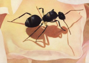
ant on rose petal, ordonez

greydog: We assume that you have a naturalist’s heart and eye, given your detailed paintings of insects and plants.

ro: I’m not a trained biologist, but I’ve always spent a lot of time outdoors, camping and backpacking and studying plants and animals, especially insects. I enjoy collecting live specimens and taking pictures with my digital microscope. I also go birdwatching and beachcombing and that sort of thing. Mostly I like to get out where it’s very quiet and watch things grow.

My dad was a science teacher when I was a kid, and one of my favorite toys was an old microscope with which we’d project images of live pond samples on my playroom wall. We also went on collecting expeditions to the gulf coast. My room was a combination museum and menagerie, with pinned insects, seashells, skeletons, fossils, and live animals. I was most interested in insects, and once got a detailed tour of a university entomology department from a doctoral student my dad knew.

Not much has changed in the transition to adulthood. A while back I grew a magnificent colony of Madagascar hissing cockroaches from a single pair. The excess roaches were in turn fed to a pinktoe tarantula, but, unlike Renfield, I stopped the food chain there. My wife made me get rid of them when our first baby came, but now she misses them!

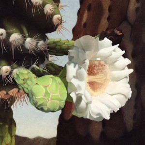
My art definitely reflects these interests. I often paint insects because they fascinate me, but also because they embody so many different shapes and colors, and seem pieced together from distinct components, like clockwork. I gravitate toward cacti and flowers for the same reason. I focus on the small-scale because I like precision, and you can’t be precise with a field of grass or a distant oak. I’ve always had trouble seeing the forest for the trees, and my paintings tend not to have much middle ground.

Saguaro Bloom
saguaro bloom, ordonez

greydog: And yet that’s perhaps what makes them so striking. You work in both oil and watercolour on a variety of surfaces. Which do you find most satisfying?

ro: I usually work in watercolor when I want to illustrate something, and oil when the focus is color and form. For watercolor I use a heavy hot-pressed paper, as this allows for a great amount of detail. Sometimes I also paint on Claybord, which consists of an absorbent clay ground on a sheet of hardboard. It’s a resilient, versatile surface, and I’ve used it for both watercolors and oils.

Over the years I’ve learned to pay careful attention to my materials, and I enjoy learning about traditional preparation methods and the chemical compositions of my pigments.

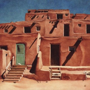
Taos Pueblo
taos pueblo, ordonez

greydog: We’d also like to mention your fractal art, which is very striking. Could you give us a simple introduction to that work?

ro: Loosely speaking, a fractal is a figure that falls between dimensions. A smooth curve like a circle or a line is one-dimensional; a smooth surface like a plane or a sphere is two-dimensional. But you could imagine a curve that’s so squiggly it transcends the first dimension but doesn’t quite make it to the second, or so disjointed that it falls short of the first dimension. That’s a fractal.

A lot of fractals (all the ones that appear in my digital art) are produced via an iterative process. For instance, you might begin with a line segment, remove the middle third, and replace it with two of the same length, meeting so as to form an equilateral triangle. You then do that to each of the four segments that result, and so on, ad infinitum. That’s how the Koch snowflake is formed.

I first learned about fractals from a film shown in my college design class. I was so impressed by their beauty that I went out and switched my major to mathematics. Now I’m a university math professor who specializes in geometry (though not fractal geometry). When I make fractal art, I’m doing something that’s quite distinct in my mind from what I do when I paint. It reflects an intellectual rather than an artistic motivation.

snowflake teragon, ordonez

greydog: Have you commercial ambitions, such as selling canvasses and prints, or book illustration?

ro: Lately I’ve sold a number of paintings through local galleries, and hope to sell more. It’s painful because I don’t like parting with my work! Up until recently I’d been storing all my finished paintings in boxes and not showing them to anybody. When I sell them I feel that I’m really giving them away and accepting a small honorarium in return for my time. That may seem pretentious, but, whatever anyone else may think of my work, to me it’s priceless and irreplaceable.

In Andrei Rublev, one of my favorite films, director Andrei Tarkovsky portrays different approaches to art and the ways in which art and practical realities come into conflict. The protagonist, surrounded by violence and spiritual compromise, descends into his own personal hell, but emerges with the conviction that art should be “a feast for the people.” And that’s come to be my own mission in life: to provide a feast for the people, to the fullest extent that my personal talents and limitations allow, through my teaching, my painting, my writing, my involvement in the local community.

I am interested in book illustration, though I haven’t illustrated anything but my own work thus far. I would enjoy illustrating the work of some of the older fantasists. Time is a limited resource, though, and it’s always a question of where to invest it. We’ll just have to see what develops!

zilla, ordonez
zilla, ordonez

greydog: We’re always looking for new artists and illustrators to investigate on greydogtales. Who do you particularly admire?

ro: When it comes to my illustrational side, I most admire William Blake and the early work of Samuel Palmer. Odilon Redon is another one of my favorites. His weird charcoal and pastel drawings make me think of Clark Ashton Smith. I’m also very fond of Pieter Breughel the Elder and Hieronymus Bosch. Both strike me as being very much in keeping with the weird horror of William Hope Hodgson, and one Hodgson cover (the Ballantine Night Land) appears to be inspired by Bosch’s depiction of hell in The Garden of Earthly Delights.

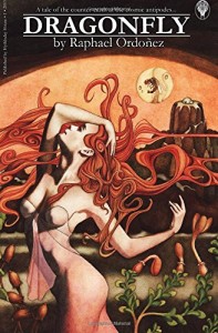
Other sources of inspiration include late medieval illumination, the engravings of Albrecht Durer, the work of earth twentieth century illustrators like Edmund Dulac and Kay Nielsen, and the art of Frank Frazetta. I’m also fond of the cover art from the Ballantine Adult Fantasy series, to which the cover painting of my novel Dragonfly is an homage, and the poster art of the film noir era.

When it comes to my more abstract pursuits, I most enjoy Paul Klee, Georgia O’Keefe, Paul Gauguin, and Henri Rousseau.

dragonfly, ordonez
dragonfly, ordonez

greydog: You also write fantastical fiction. Mostly short stories, but you do have a novel out. What sort of themes do you explore in your writing?

ro: All of my published stories are set in the counter-earth at the cosmic antipodes (an explanation of which would involve an excursion into topology) and feature Paleozoic life forms, antediluvian races, and supernatural entities based on Greek and Semitic mythology. The human civilization in which the stories take place might be described as Steam Age (but not steampunk!) with Louis Sullivan skyscrapers and Art Nouveau flourishes, and occasional Bronze Age incursions.

My most recently published story, “The Scale-Tree” (Beneath Ceaseless Skies) is mainly about art, and especially the Paul Klee quote referred to above. But in general my stories have to do with man and nature, particularly with the seeming impossibility of preserving a sense of hope or life-purpose in the face of a universe characterized by corruption and entropy and decay and dissolution.

I’m most inspired by older, “pre-genre” fantasy novelists, from Lord Dunsany and David Lindsay down to J. R. R. Tolkien and Mervyn Peake. I also like pulp-writers like Edgar Rice Burroughs, Clark Ashton Smith, and Robert E. Howard. On the science fiction side, A. E. van Vogt, Philip K. Dick, and Gene Wolfe are my favorite authors. My longer works tend to be action-oriented, with a certain hard-boiled vibe, and Raymond Chandler and Dashiell Hammett are frequent sources of inspiration. My short stories owe something to Flannery O’Connor and Raymond Carver.

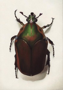
beetle, ordonez
beetle, ordonez

greydog: And while we’re talking about fiction, you yourself have an interest in William Hope Hodgson, to whom we raised a glass throughout October.

ro: Yes, Hodgson is definitely another major influence, especially through The Night Land and The House on the Borderland. He was clearly motivated by some of the themes I just mentioned. He might be said to have found his own answer to the horrors of a malignant universe winding slowly toward heat death, in the form of a time-transcending erotic love. That’s not an answer that can satisfy me. But perhaps it’s enough for me that he understood the question, which is, I feel, the question of my own life.

greydog: And finally, what’s next for Raphael Ordonez – more fiction, more painting, or both? Do you have a major project on the go?

ro: I have a short story (“Salt and Sorcery”) and a novel (The King of Nightspore’s Crown) in the works, both of which will hopefully be published in the not-so-distant future. The latter will feature another wrap-around cover by yours truly. That’s my next big artistic project.

greydog: Many thanks for your time, Raphael Ordonez.

51I6KUIlt2L

Fletcher Vredenburgh, reviewing Raphael’s first novel Dragonfly on Black Gate, said:

Dragonfly is the first of a planned tetralogy. In this day of calculated, mass-marketed, trend-following books, here is a self-published adventure, practically handcrafted, with cover, map, and interior art all done by Ordoñez himself. It tells of a young prince let loose in a world of steam engines, complacent aristocrats, and tunnel-dwelling workers, and a social order on the verge of being overthrown. Ordoñez’ style hearkens back to the likes of A. E. van Vogt and Jack Vance, as well as Edgar Rice Burroughs.

Dragonfly is available here (check image in sidebar for UK source):

Dragonfly Amazon.com

And do visit Raphael’s website Alone with Alone for more examples of fractals, other art and thoughts on many topics of interest.

Alonealone with alone

Next time on greydogtales: Hm, depends on whether or not I ever finish this cursed Cthulhoid story I’m writing. So either a fascinating new article, or a picture of a longdog chewing a teddybear…

Share this article with friends - or enemies...

Sebastian Cabrol: Strange Secrets of South America

Hola y bienvenido. Our dark art theme continues to grow. Following M Wayne Miller‘s great contribution, another first for greydogtales – an exclusive, fully-illustrated interview with the talented Sebastian Cabrol. Sí, es nuestro primer artículo de terror Sudamericana.

If you didn’t already know, there’s a whole South American scene for fantastic dark art and literature, with linguistic links to horror in Spain and Portugal as well. We’re quite excited about these new connections of ours, because we love to poke around in other people’s weird backyards.

ghost-low
cabrol

Sebastian Cabrol is an Argentinian artist who has produced many fine, moody pieces of weird art and who deserves wider recognition, especially outside the Spanish-speaking world. Not only that, but Diego Arandojo, another gifted Argentinian creative, has written a short article for us on working with Sebastian, which provides further insights.

sebastianpic

Aquí es Sebastian…

greydog: You’re not totally new to greydogtales, Sebastian – we featured some of your work during our William Hope Hodgson festival in October, particularly your striking illustrations for The Night Land and The House on the Borderland. So we want to start by asking you about your other work in the past. Can you give us an example of an earlier project which you enjoyed, something which we might not know over here?

sebastian: Although I’m not new in the artistic field either, somehow I haven’t published a lot of things, in fact my favourite project is still unedited. It’s an illustrated version of William Hope Hodgson’s “Demons of the Sea”. I think it will be released in 2016. Of course I strongly recommend the illustrated Spanish version of “The House on the Borderland” which was released just a month ago!

demons of the sea, cabrol

greydog: And we’ve seen inside it, great examples of your style. Is there any one illustrator or painter who inspired you at the start?

sebastian: A lot of people inspired me as a kid, from Argentinian artists such as Lucho Olivera, or Alberto Breccia, to foreign ones as Moebius, Enki Bilal, Berni Wrightson and Brian Bolland. Movies like David Lynch´s Dune and Alien were a great source of influence too.

alberto breccia - the dunwich horror (1979)
alberto breccia – the dunwich horror (1979)

greydog:  We’re reading Breccia comic strips at the moment, and we were mad for Bilal when we were younger. Looking at your own portfolio, many of your pictures have muted, sometimes monochrome, tones. Is this done for the disturbing effect, or do you prefer to work in these tones rather than full colour?

sebastian: I enjoy full coloured illustrations, I really do, but I don’t feel confident enough to use a great variety of tones as I colour my work. One part of me thinks that a limited palette adds more atmosphere and mood, and another part just give this advice: you’re not an expert on handling colours, so have some restraint! In my defence I must say that I’ve always focused more on lighting and composition rather than colour.

hermidainteriorcabrol
cabrol, courtesy arondojo

greydog: As mentioned, we first came across your work when we were looking at horror books around the world, through your work for Hermida Editores. Do you work with other publishers in Spain and elsewhere, or is most of your art for Argentinian markets?

sebastian: I’ve worked mainly for Argentina and Spain for now, but I hope that will change in the near future.

demons of the sea-08
demons of the sea, cabrol

greydog: It should do – publishers take note!  So, we’re asking two or three other book illustrators about creative freedom. Do you find that you get strict instructions from the publishers, or do they allow you the freedom to select images and interpretations?

sebastian: I guess I’ve been very lucky since in every project done as an illustrator I’ve enjoyed true freedom to do the things that please me (in the comic field usually there’s more control from the writer or the editor) I really can’t complain at all.

Secret worship-01
secret worship, cabrol

greydog: We admit we don’t know much about the Argentinian weird and horror scene. On the horror film side we hear interesting things about film writer/director Adrián García Bogliano and his brother Ramirez. Many people will have read a lot of Jorge Luis Borges‘ magical-realism, which includes some weird twists. And there’s you and Diego, of course. Is there anyone we should all be reading/watching?

sebastian: Oh, I’m not an expert nor have I read everything produced in South America to be honest, but you definitely should check the work of Alberto Breccia (Uruguayan master of horror and chiaroscuro, often imitated, but never matched), as we said above, plus Horacio Lalia, Oscar Chichoni and the exquisite work of Quique Alcatena, perhaps the best living illustrator from Argentina. Perhaps they sound familiar, since all of them worked for UK publishers Thompson on 2000AD.

Talking about literature, you already mentioned Borges, and I would like to add Julio Cortázar, Leopoldo Lugones, Adolfo Bioy Casares, Horacio Quiroga, Jacobo Bajarlía, Mario Levrero and Antonio Di Benedetto. Sadly I don´t know a lot of modern writers (with the exception of Diego Arandojo) but they surely continue the path of those Latin American masters.

secret worship_02
secret worship, cabrol

greydog: There are some fantastic names there, which we’d like to follow up in a later article. But back to you – you’ve also been an inker, for example your work for Caliban by Garth Ennis and Facundo Percio. Is it easier, or more frustrating, to ink someone else’s work?

sebastian: I find it easier to ink over someone else’s pencils, I don´t struggle at all. I know that in the beginning it can be hard to face that responsibility of finishing the pages, and it’s a bit stressful, but as the pages flow you become more sure. I enjoy it, actually.

Secret worship_03
secret worship, cabrol

greydog: Which writer(s) would you most like to illustrate if you had the chance?

sebastian: I would like to work with the authors I love, the previous mentioned and I would add one of my favourites: Arthur Machen. Of course I would be happy to do something based on the work of RL Stevenson, A Blackwood, Sheridan Le Fanu, M R James, Clark Ashton Smith, Ambrose Bierce, Clive Barker, etc. Basically my main group of favourite authors since my teenage years.

cabrol
cabrol

greydog: And finally, greydogtales would love to see more of your work. Do you have any other new projects that you can share with us?

sebastian: Right now I’ve just finished my part in a comic anthology called “H.O.U.N.D.S” based on supernatural detectives such as Jules de Grandin, Carnacki or John Silence. Writer Rodolfo Santullo and I adapted “Secret Worship” and I think it´s one of the best work I’ve done so far. I’m very proud of it.

borderland-14
borderland, cabrol

greydog: And as a bonus, readers can see some of the “Secret Worship” panels throughout this article. Gracias, Sebastian Cabrol.

sebastian: Thanks very much to you, John.

Sebastian’s own website, with many other illos, is here:

cabrol art

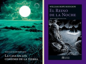
If you read Spanish, below is the link to the William Hope Hodgson works which Sebastian has illustrated for Hermida Editores.

hermidastitchhermida editores – william hope hodgson
####

diego

Our second guest, Diego Arandojo, has published stories and plays, is a film director, a comic writer and is trained in graphic design and illustration. He has recently edited Lovecraft en Argentina by Carlos Abraham, containing essays on H P Lovecraft‘s status and influence in Argentinian writing. While we were chatting to him about the Abraham book, he offered this reflection on Sebastian, which was perfect for today. For the original Spanish text, click the next link:

memorias de la oscuridad espanol

Y aquí es Diego…

MEMORIES OF THE DARKNESS – My journey with Sebastian Cabrol

Throughout my years as a writer and screenwriter, few times have I felt so impressed by the work of a cartoonist. One of these artists, possessed of a deep and very personal way of working, was Sebastián Cabrol.

We started working together in 2007. I did a free adaptation to comic of the story by Robert Bloch “The Feast in the Abbey”. Editor Matías Timarchi (who currently runs the Argentinian publishers OVNI Press) appointed Cabrol to draw my script. The result was stunning. The pages were full of darkness, of coldness; Cabrol’s style works in a mystic way with an incredible density.

Three years later, in 2010, our adaptation “The Feast in the Abbey” was published in the book “Relatos de No Muertos” (Tales of the Undead) (OVNI Press).

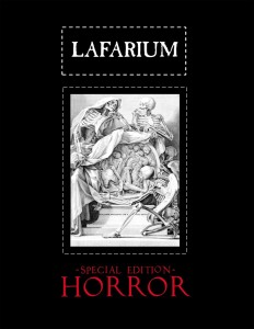
From this first collaboration onwards I was interested in continuing to work with Sebastian. In 2009 (before the publication of Bloch’s story) we did the comic “Trapped in Sleiggh”, much in the style of the BBC’s horror series. This comic was published in 2015 in the digital magazine “Lafarium”, in a special edition of horror stories in English.

Returning to the year 2010, I asked Sebastian permission to include his illustration of the Blason de Cthulhu in the CD tribute to H. P. Lovecraft issued by the Spanish label, GH RECORDS.

At the same time, Cabrol did illustrations for a book of mine (as yet unpublished) called “Disposable Kids”, and illustrated the cover of a play (also unpublished) called “The Four Messengers”, based on the film “Las 77 Páginas” (The 77 Pages), which I did together with Mauro Savarino, produced on DVD, also by GH RECORDS of Spain.

With the release of the DVD of “The 77 Pages”, Cabrol drew a comic based on this film (not yet unpublished).

In 2014 Cabrol drew the cover of my book “Lafarium”, a collection of esoteric essays and short stories from my magazine of the same name. In this book, there is also an illustration of Sebastian based on my short story “Knonix”.

In 2015 I published in the online edition of “Lafarium” an eBook entitled “Suspira de Lobos” (Sigh of Wolves), with art by Cabrol, that tells a story about the Genesis of the Bible, and the birth of the fight against the werewolves and vampires. There were originally two chapter titles drawn by him, which formed part of an unfinished project that I undertook together Matías Timarchi many years ago, called “Wolfmaiden”. Cabrol drew the opening titles of each chapter and Facundo Percio did the rest of the work. “Wolfmaiden” was never published.

We currently have many ideas for working on various comic strips. For me it is an honour to work with an artist like Sebastián Cabrol, who, in addition to his talent is an excellent human being. In 2014, I was able travel to meet him in person, after so many years of working at long distance. On that occasion I took the opportunity to make a short film about him.

I admire and respect him.

Have a look at Diego’s Lafarium site, which has the special September 2015 Horror edition on it. Check the link below the image.

lafarium1

lafarium

We should add that vital translational expertise was provided by our good friend Sarah Mooring from Alicante, who deserves praise for the bits we got right. Any mistakes are ours. As usual.

####

We hope to have Diego and Sebastian back again in the New Year to tell us more about what they’ve been up to, and it would be foolish of us not to pursue more of the writers, artists and projects raised in the above pieces, so Argentina will return to greydogtales. Or the other way round. Much reading and research is called for. Más de terror Sudamericana y Española en el futuro.

We wanted something audiovisual to end with, so we picked a short Argentinian horror film by Andres Borghi, with English sub-titles. Be warned, it’s a little unsettling.

Now go walk the dog, and stay off the computer for a while. You’ll feel better soon…

Coming next week: classic supernatural fiction, an interview with artist Raphael Ordonez, and some lurchers in there somewhere…


Share this article with friends - or enemies...

M Wayne Miller: An Artist Speaks

Weird art today, longdogs in the mid-week(ish) and horror fiction by Saturday. We’re careening all over the place at the moment, which means that we’re both ‘moving swiftly and erratically’ and ‘being hauled over for repairs’. Lots of background and menu bits to freshen up, basically. We did think about going wild and becoming the Internet’s premiere ‘Nice Pussycat Photos and Enid Blyton Tribute’ blog, but then we felt slightly ill. So we won’t do that. Lurchers and creepy stuff must prevail.

The Horror out of Toytown has its appeal though….

in the garden of the queen (2013)

As promised, we now have our interview with that most excellent artist friend of ours, M Wayne Miller. Instead of some made-up introduction, we quote from his bio at Dark Renaissance Books, for whom he has done many covers and illustrations:

M. Wayne Miller made his mark in the 90’s as a consummate b/w illustrator for numerous book and magazine publishers as well as several role-playing game publishers. While the b/w market was a fine place to cut one’s freelance illustrator’s teeth, and he did well, it was a stepping-stone to the more competitive and lucrative color illustration market. After an artistic conversion to color work, Wayne re-emerged as a cover illustrator for specialty press and mass-market book publishers, as well as for role playing games, online publications, and private commissions.”

wayne

For us, Wayne’s work is particularly fun because he captures the ‘full-on’ action style which represents weird adventure at its best, and what they used to call a rollicking good story. Let’s hear from The Man (the art below should be clickable for larger versions – possibly):

greydog: Welcome to greydogtales, Wayne. We’ve been looking forward to having you here, as many of our listeners will know you from your cover art for so many weird and horror books. Was working in that genre a personal choice or one driven by the market?

mwm: Horror has always been a genre I enjoyed in both narrative and visual format. As a kid I loved old b/w movies late at night such as The Creature From the Black Lagoon, The Giant Claw, and The Black Scorpion. Of course there was Godzilla, and all the giant monster movies, as well as the creepy sci-fi stuff like Forbidden Planet and The War of the Worlds (the original, of course). My reading followed in this vein, though it was middle school and high school before I really got into much actual horror. I blame Stephen King for making me an avid horror reader. In the years since, I have continued to read and watch horror fare, so one would be safe in saying that I was seasoned and simmered in the genre through my formative years, which I have no doubt led to my enjoyment in creating such artwork.

arvis winfield's fate, deathrealm magazine (1995)
arvis winfield’s fate, deathrealm magazine (1995)

With regard to my illustration career, I would say the market provided the opportunity. My first published illustration appeared in Deathrealm magazine in 1995. From there I went on to have work appear in lots of other horror genre periodicals and story collections. Like stepping stones, one led to another, and momentum was achieved. Once my cover illustrations began to appear on Dark Regions Press publications, cover opportunities came my way. I won’t go as far as to say I am typecast as a horror illustrator, but for many years, that is exclusively where I worked. As with most things, times change, so much of the horror work has fallen away, replaced by fantasy and sci-fi.

the grey boats, dark renaissance books (2015)
the grey boats, from willie meikle’s carnacki – heaven & hell, dark renaissance books (2015)

greydog: We interviewed Willie Meikle here last month, and of course you’ve illustrated many of his stories, particularly his Carnacki pieces. Are you a fan of William Hope Hodgson?

mwm: Yes indeed. Willie and I have worked together on countless projects. He is hands down the writer I have worked with the most in my career. We often joke that we are a tag team, and unbeatable as such. One of the things I love about Willie’s work is that he takes characters like Carnacki, Sherlock Holmes, and Professor Challenger, and writes new fiction that is every bit as authentic as the original works featuring these characters, with the added spice of lots of supernatural happenings and creepy monsters. And yes, I am a fan of William Hope Hodgson, as well as Sir Arthur Conan Doyle, so doing artwork based on these writer’s legacy is a special treat for me.

the island of terror by willie meikle, dark renaissance books (2013)

greydog: We’ve seen a wide range of sketches, monochrome pictures and glorious technicolour pieces from you. What’s your own favourite medium?

mwm: If by favourite medium, you mean the one I use most often, digital is my thing. All of my published work for hire, outside of a very few in the beginning, is digital. That meaning that I do my sketching, concepting, and refined drawing with pencil and paper, and all finished painting whether monochrome or colour, in the computer. While I do all my painting digitally, I honestly can’t say it is my favourite medium. I still miss the smell of oil paints and linseed oil, which digital does not provide. In the past I loved pen and ink illustration, but nowadays, charcoal pencil on mid toned paper would be my favourite.

bedlam in yellow, dark renaissance books (2015)

greydog: How competitive is the world of weird art? We know that a number of illustrators collaborate, but for those who are just entering it, is it a dog-eat-dog sort of market?

mwm: Honestly, I find the fantastic illustration market to be a very welcoming and nurturing environment. There are many artists I know personally who go out of their way to provide advice and tutelage to aspiring artists entering the field. The internet has opened an entire vista of learning, tutorials, and avenues for showing work. Certainly a good thing in itself. However, making one’s work stand out in this maelstrom is now more important than ever. Getting work is far from a simple affair, as one still needs dedication to improve one’s craft, as well as perseverance in the face of rejection and stiff competition.

the turtle, dark regions press (2014)

greydog: That last bit’s painfully true for many of us. Now, we never ask where people get their ideas or inspiration if we can help it – it’s a bit of a stock question. What we would like to know is how much you can get your own vision across. Do you have much creative freedom on a book commission?

mwm: Having the freedom to pursue one’s own artistic vision is not the goal of an illustrator. That is not to say an illustration is not the artistic vision of an artist, but only that the aim is to support the narrative or concept for which the work was commissioned. I never go into a job hoping to fulfil my own artistic agenda. Rather, I aim to capture the subject matter, whether idea or text, and make it a visual reality. This process is very much my own vision, and often I have full freedom to do as I wish in this endeavour, but ultimately it is the subject that dictates the result.

apocrypha, thunderstorm books (2014)

greydog: And what sort of time-scale do you allow to produce a full colour book cover from scratch?

mwm: Most of my commissions take one to two weeks. This does not include reading time for a manuscript. The concepting process is the variable, as that is the part of the job where an idea is settled upon through working with the publisher and author to clarify the rough drawing. Sometimes this process is quick and painless. Other times it is a real effort to clarify the agreed upon rough. Once painting begins, a week will suffice for most covers in an ideal world where that is the only project on my plate. The reality is that I work on more than one concurrently, with each one at different stages. This allows me to maintain an efficient workflow, and also to “get a break” from one project when I work on another.

for the bible tells me so, orson scott card's intergalactic medicine show (2015)
for the bible tells me so, orson scott card’s intergalactic medicine show (2015)

greydog: On the subject of workflow, your style would obviously be perfect for graphic novels. Have you ever considered, or been approached about, taking on that sort of work?

mwm: It has been offered, and while I would love to do such work, honestly, I don’t have the patience for sequential art. Drawing the same characters interacting is not something I am well suited for. I do enjoy inking existing sequential art, but that happens rarely. I would, however, take all the cover work for comics and graphic novels that I can get. That way I get to draw the characters in one really big detailed scene, and then I am on to something else.

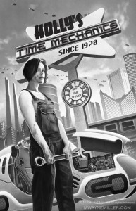
the time mechanic, orson scott card's intergalactic medicine show (2014)
the time mechanic, orson scott card’s intergalactic medicine show (2014)

greydog: Our last shot – when the work’s over, and he wants to chill out, what does M Wayne Miller really do? Sketch, read, get the DVDs out or head for the bar like most of the greydogtales team?

mwm: Is work ever over? Ha! What down time I get usually involves reading, movies, TV, or video games, but even unrelated past times are still feeding my artistic well, so it could realistically be said I am always “on the job”. All that being said, I am not averse to having a pint at all!

greydog: Good man! And thank you very much, Wayne.

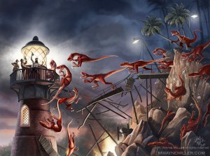
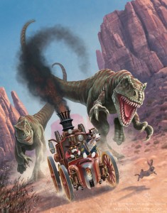
story emporium, purveyors of steam punk & weird western adventures (2015)

And we’re out of here, as you can see from Wayne’s illo above. I think Wayne’s the one driving. He has a website, with more illos, and links to where you can buy his prints, that you can visit here:

mwaynemiller.com

And for completists, Dark Renaissance Books can be found here:

dark renaissance books

Don’t forget, if you subscribe to greydogtales or follow me on facebook, you’ll never miss a post. If you don’t subscribe, I’ll just whine outside your bedroom door all night, so you might as well do it…


Share this article with friends - or enemies...